A Fresh New Look for Live Tap Lists: Better on Mobile, Simpler to Navigate
The Live Tap Lists dashboard has a new look. Every page is cleaner and simpler to find your way around. The biggest change is on your phone: Menu Items has been rebuilt from the ground up for a small screen, so you can tap a keg on, fix a price or swap a photo with one hand. We gave the website a matching refresh, too.
Your menus haven’t changed. Your boards, print menus, web menus and QR menus look exactly the same as before, and so do your settings and the way everything works.
It started with your feedback
We hear from a lot of you, and most of what we hear is good. You like how quickly you can update a menu and see it on every TV, printout and website at once. You like that it’s simple.
Two requests kept coming up, though:
- “I update my menu from my phone, and it could be easier.” A lot of updates happen behind the bar or in the taproom, not at a desk. Tapping a new keg on with a phone in one hand should feel natural.
- “Sometimes I have to hunt for things.” As we added boards, print menus, schedules, integrations and promos, some settings got harder to find.
So we kept everything you like about Live Tap Lists and worked on those two things. Here’s what changed, with the old dashboard on the left and the new one on the right.
The big one: update your menu from your phone
This was your number one request, and it’s the change we’re most excited about. On a phone, Menu Items is no longer a shrunken copy of the desktop table you have to scroll sideways through. It’s a simple list built for your thumb.
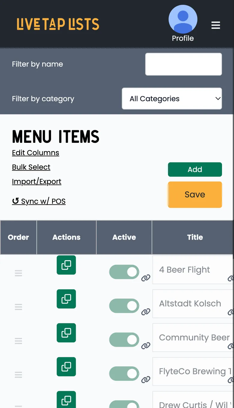
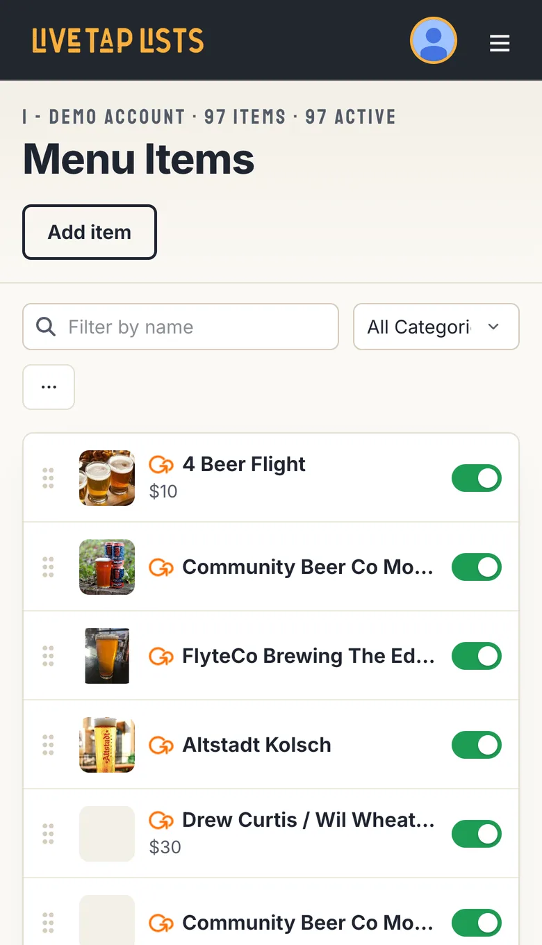
Tap any item and an edit sheet slides up with everything about that item in one place.
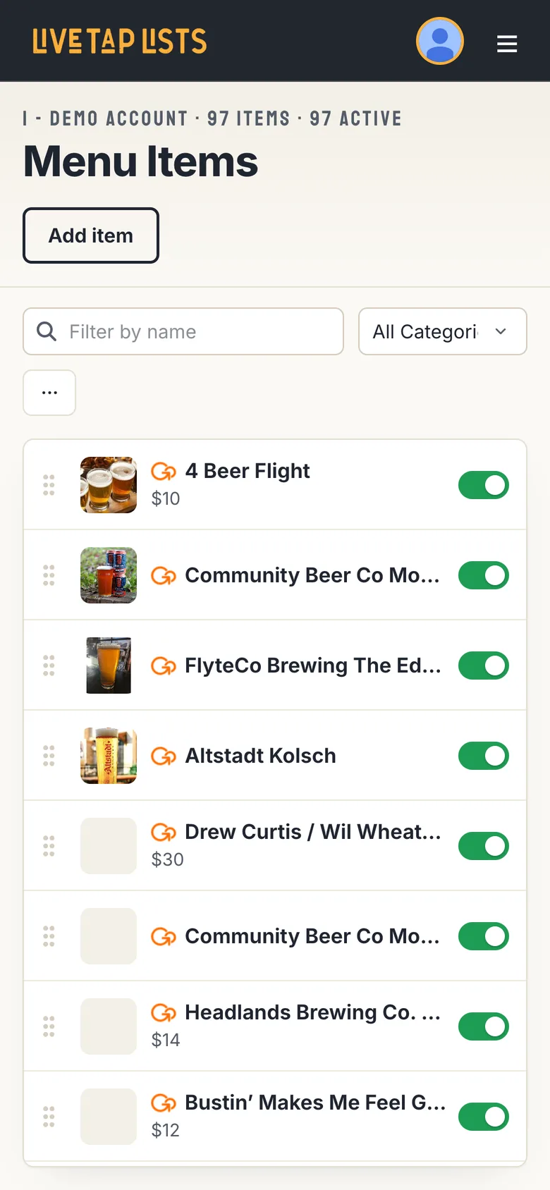
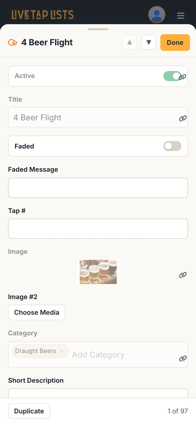
- One clean row per item. Each row shows the photo, name and price, with the on/off toggle right there. Turning a keg on or off takes one tap.
- Every field in one sheet. The sheet shows the same columns you use on a computer, stacked one above the other with room to type, plus categories, photos and POS sync.
- Work through your whole menu. The up and down arrows jump to the previous or next item without closing the sheet, and a counter shows where you are, like “1 of 97.”
- Duplicate in a tap. Duplicate sits at the bottom of the sheet, so adding a similar beer is quick. Items you added yourself have Delete there, too.
- Nothing saves by surprise. Your changes wait in the save bar until you tap Save, just like on a computer.
- A tidier toolbar. Search and the category filter stay at the top. Edit columns, Bulk select, Import/Export and Sync with POS are tucked into the ••• menu.
- Reorder with the grip. Drag the grip on the left of a row to move an item up or down your menu.
Menu Items: the page you use most
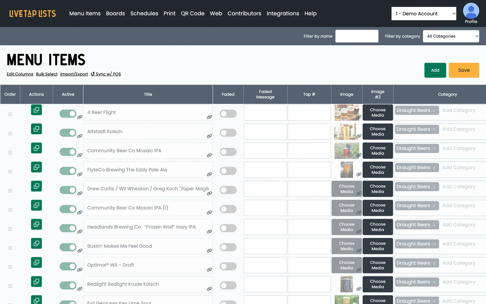
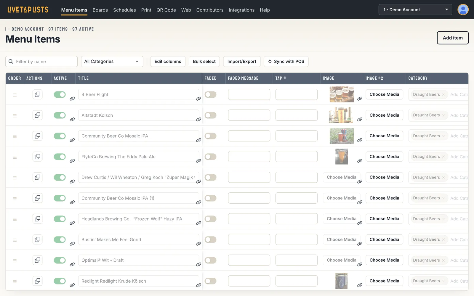
- Everything in one toolbar. Search, category filter, Edit columns, Bulk select, Import/Export and Sync with POS sit in one row of clear buttons, not scattered text links.
- You always know where you are. The page title shows your location, how many items you have and how many are active.
- A calmer table. The item name column stays in place while you scroll sideways, and the table fills the page.
- Bulk changes made easy. Select several items and a bar appears so you can activate, deactivate or delete them all at once.
- A save bar that shows up when you need it. It appears only when you have unsaved changes, so it’s hard to miss when it matters and out of the way when it doesn’t. ⌘S / Ctrl+S still saves.
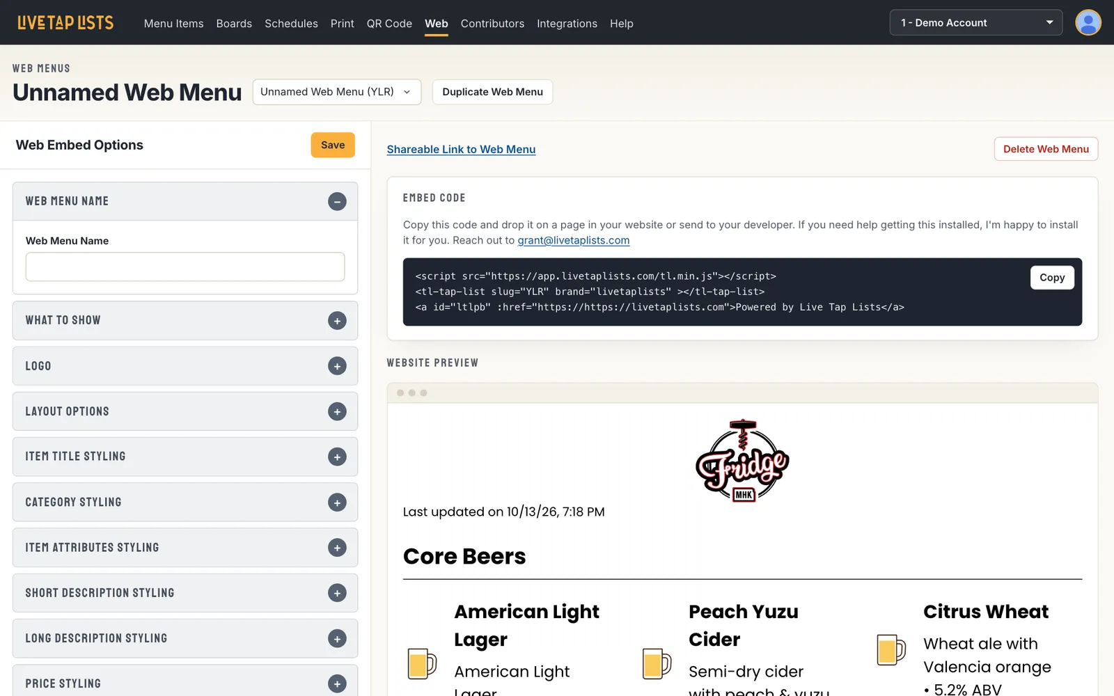
Boards, print and web menus: settings that are easy to find
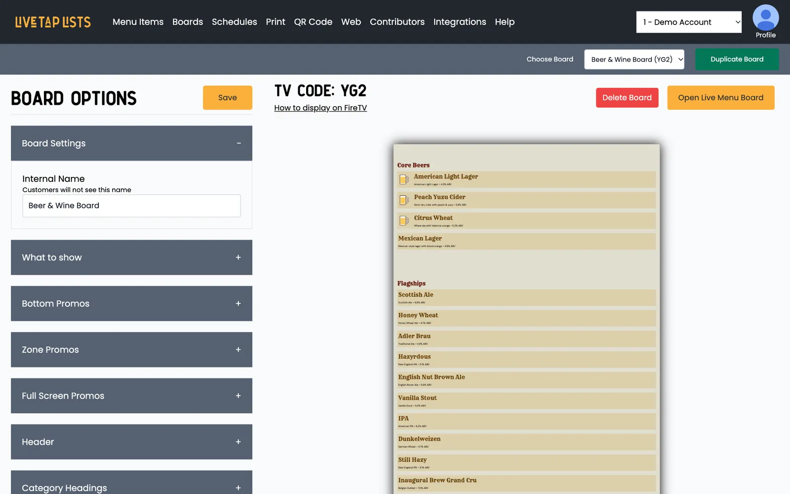
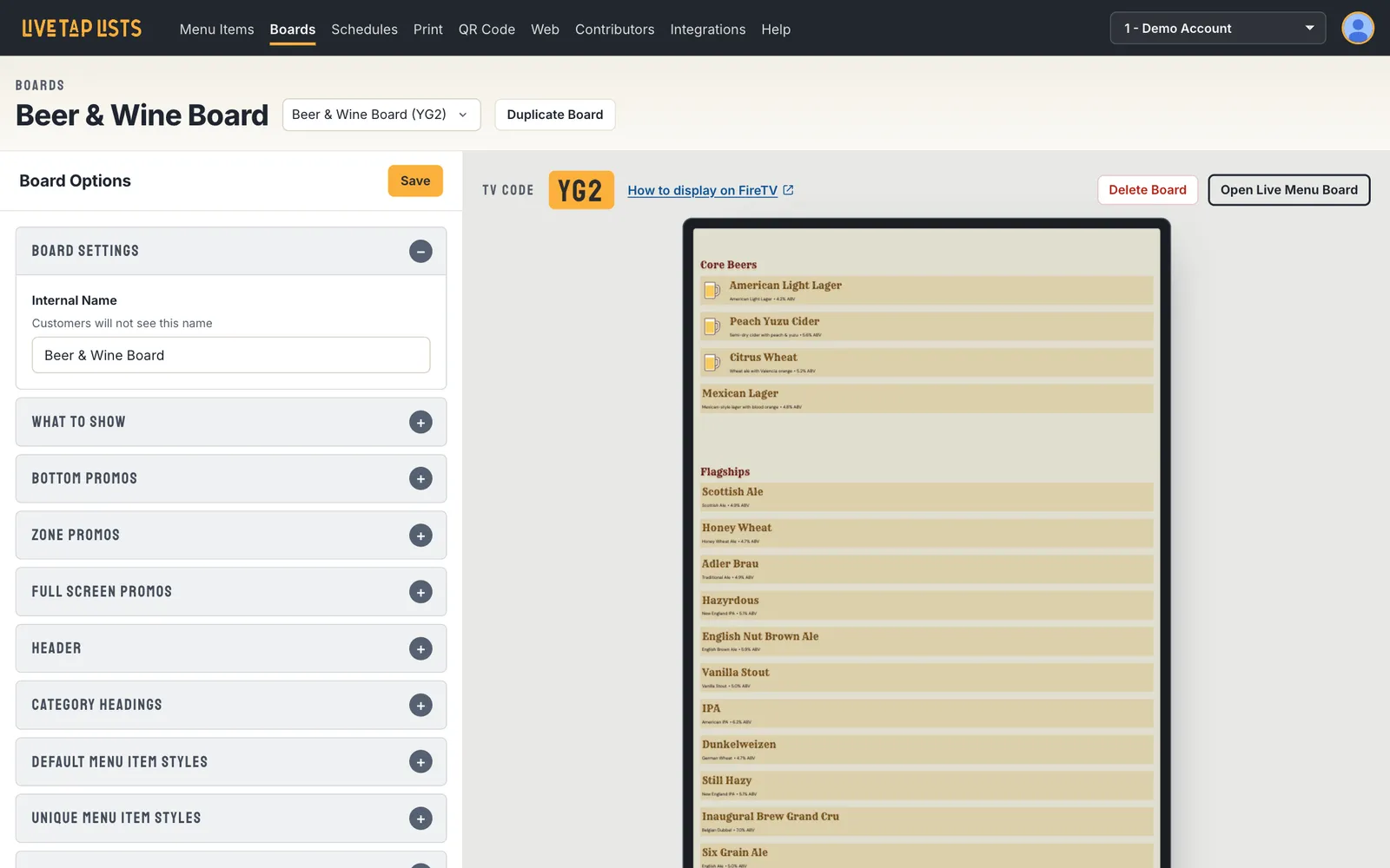
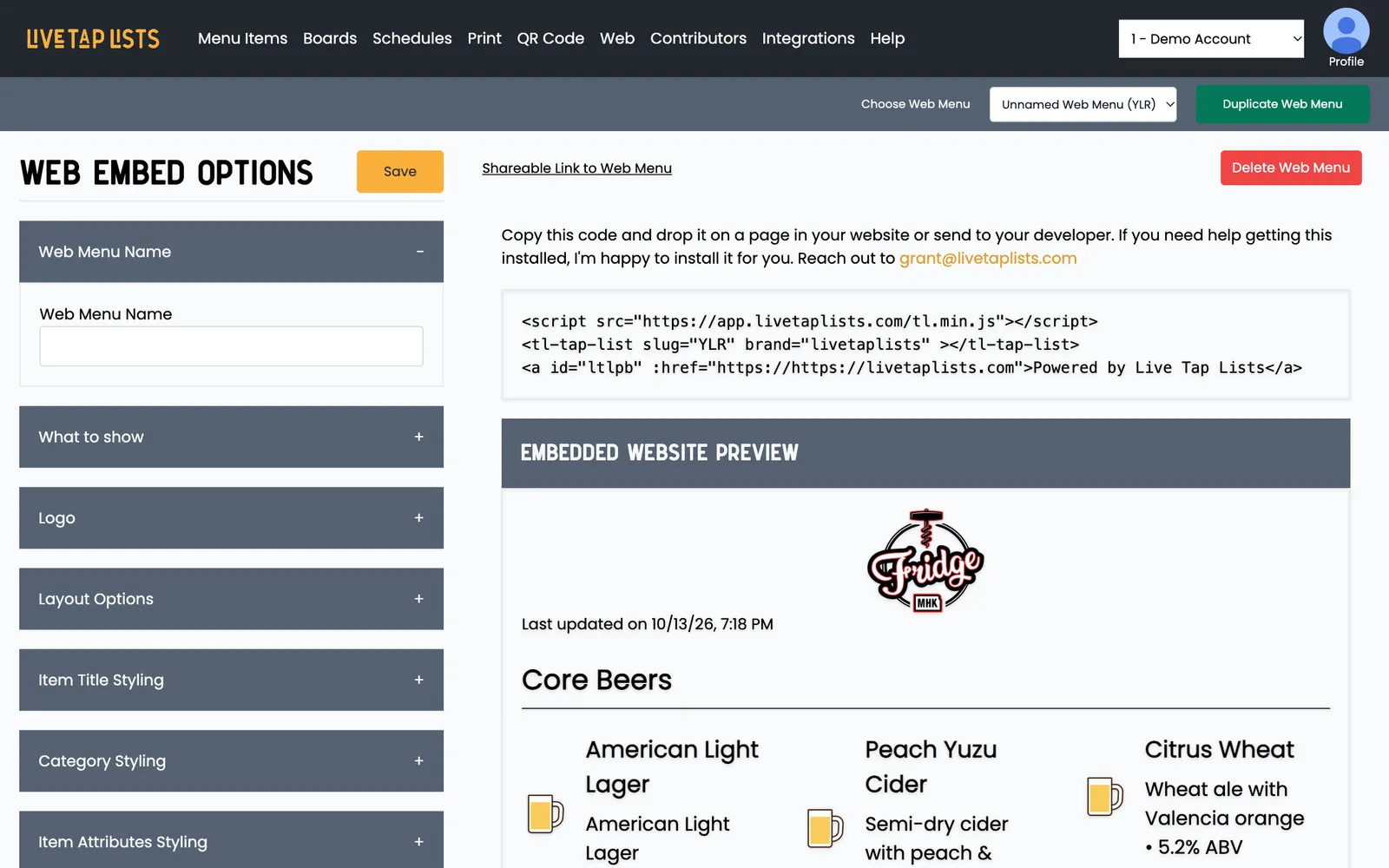
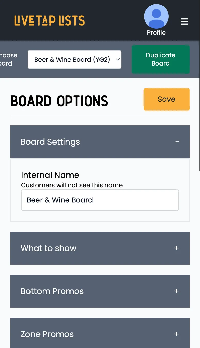
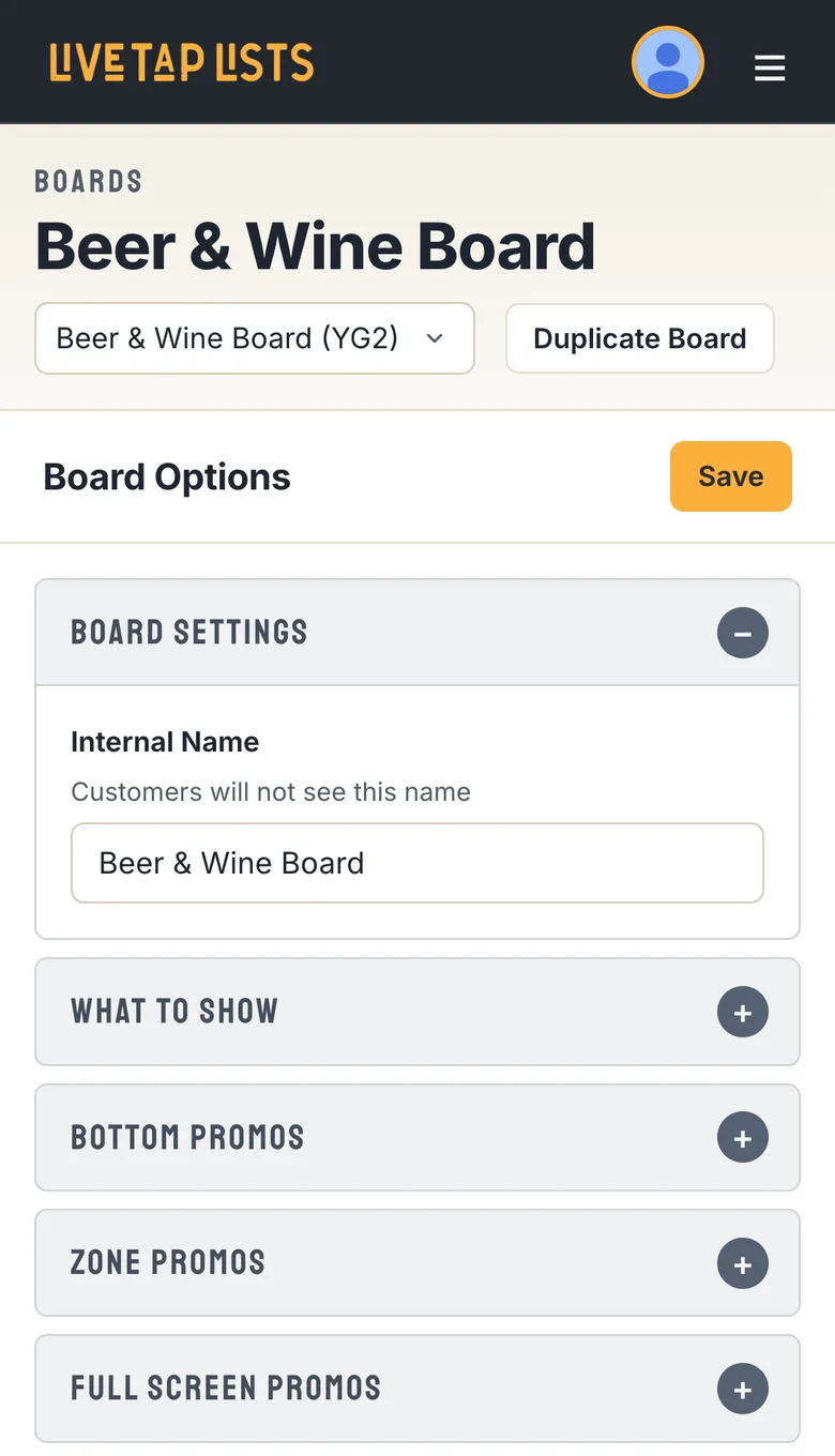
- Switch from the page header. The name of the board, print menu or web menu sits at the top of the page, with the switcher and Duplicate right next to it.
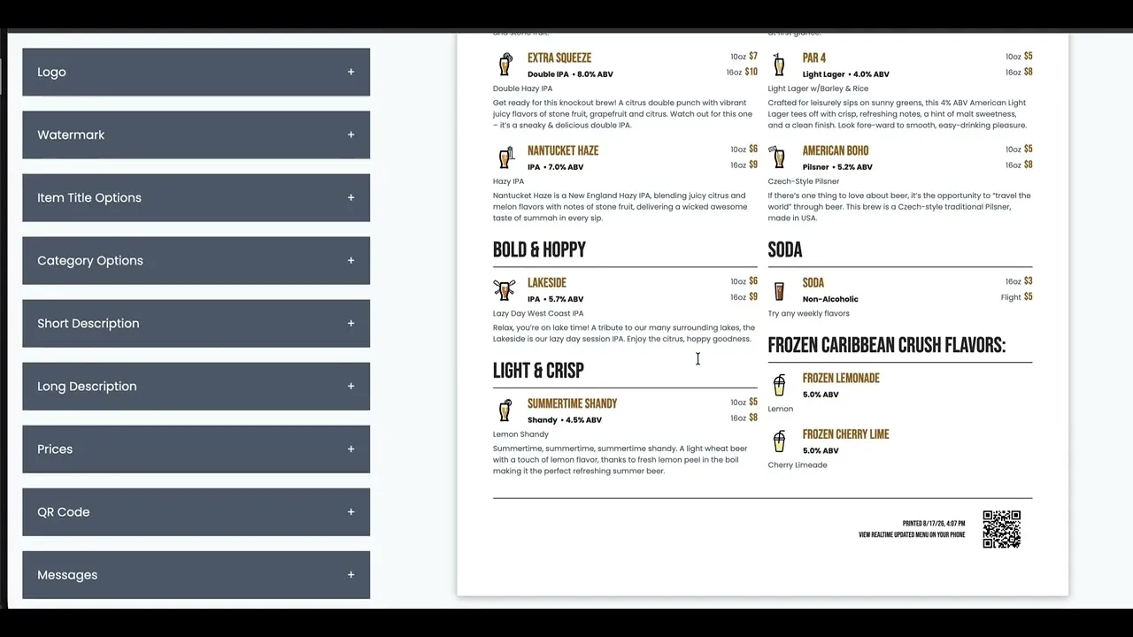
- Settings grouped into sections. Each group opens and closes with one tap, and Save stays pinned at the top of the panel while you scroll.
- Your TV code stands out. It’s big and easy to read, so it’s simple to type into the Fire TV app.
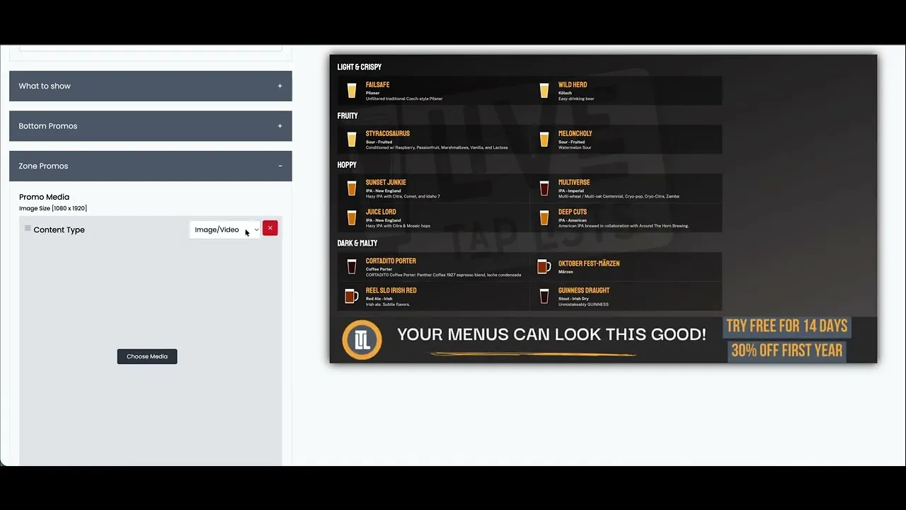
- A preview that looks like the real thing. Your board shows in a TV frame, your print menu on paper, and your web menu in a browser window.
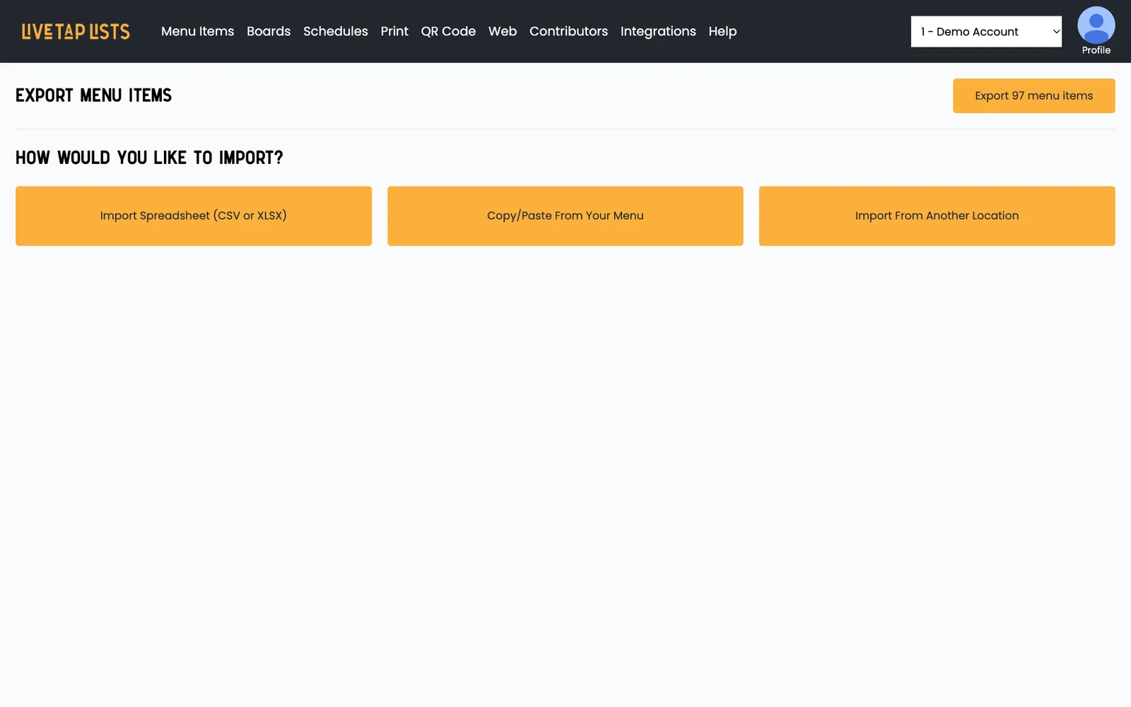
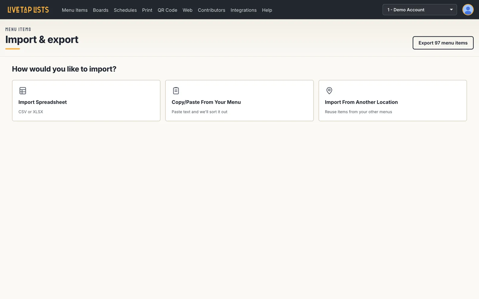
Integrations and Import: clear choices
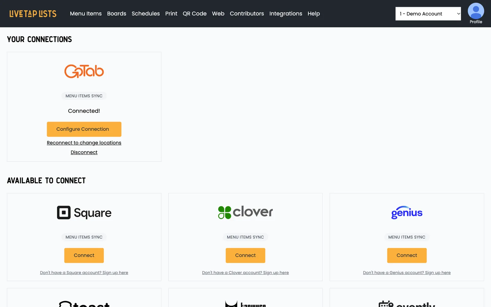
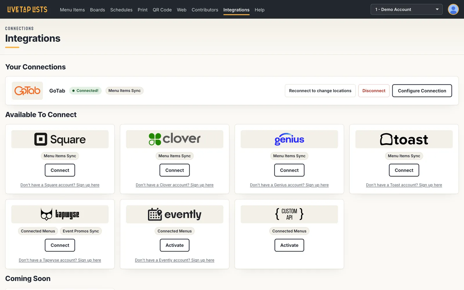
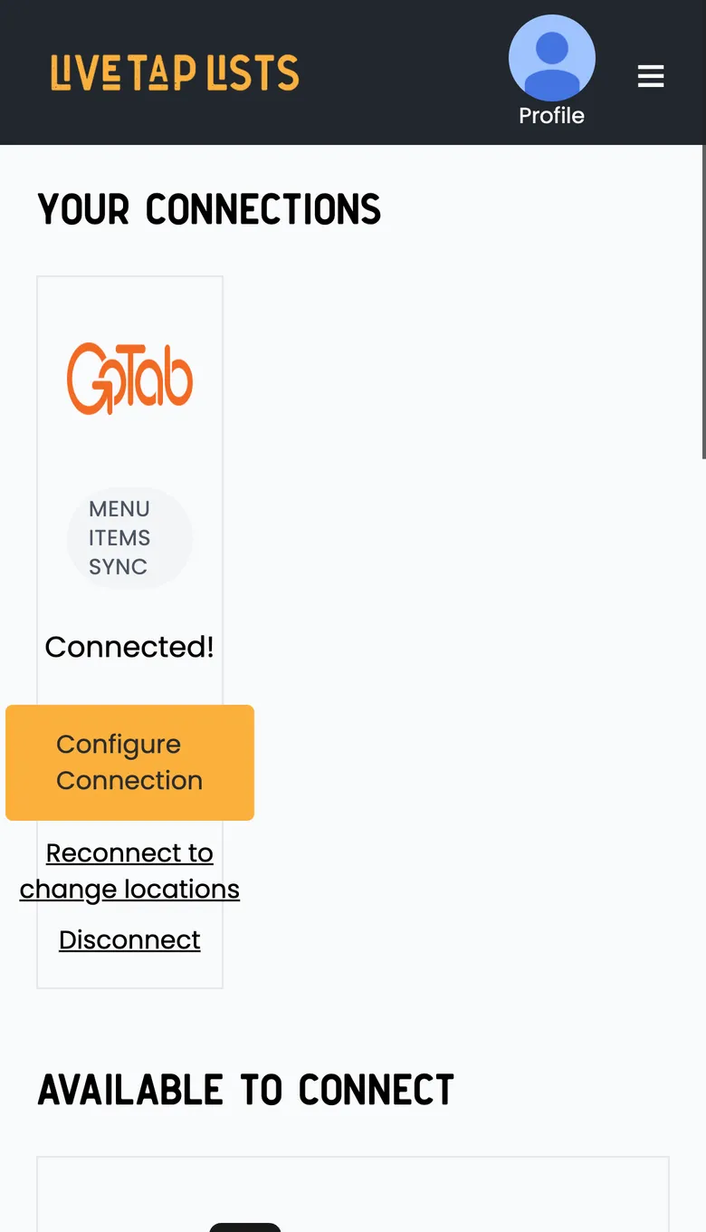
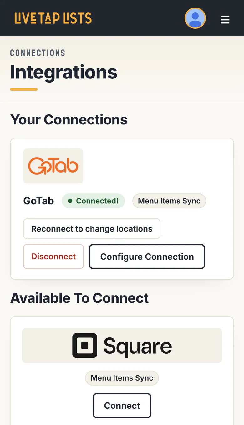
Your connected POS now sits in one row, with its status and actions together. Everything else you can connect is laid out in a compact grid, so you can see all your options at a glance.
Built for your phone
Menu Items isn’t the only page that got the phone treatment. Every page now adapts to a small screen instead of squeezing the desktop layout onto it.
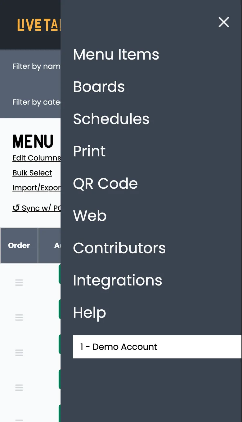
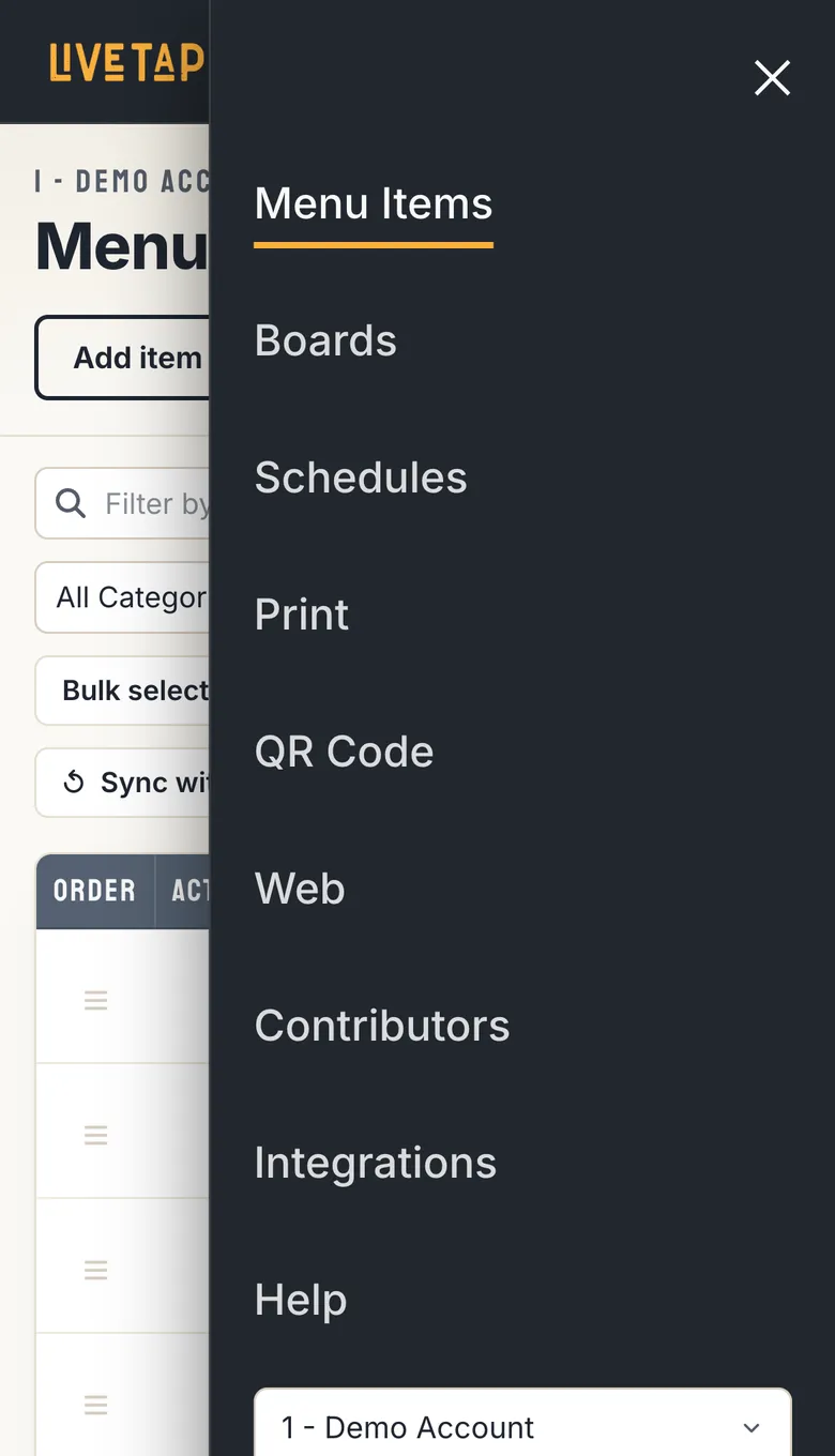
- A menu built for your thumb. The navigation slides out with large links, highlights the page you’re on and keeps your location switcher within reach.
- Nothing cut off. Switchers, buttons and cards fit the screen instead of running off the edge.
- Controls sized for fingers. Inputs, toggles and buttons are spaced so you can tap the right one the first time.
The same look on our website
We also rebuilt livetaplists.com to match. It’s faster, it’s easier to read on a phone, and it’s organized around the questions people actually ask: Features, Integrations, Who it’s for, Pricing and a blog you can filter by topic.
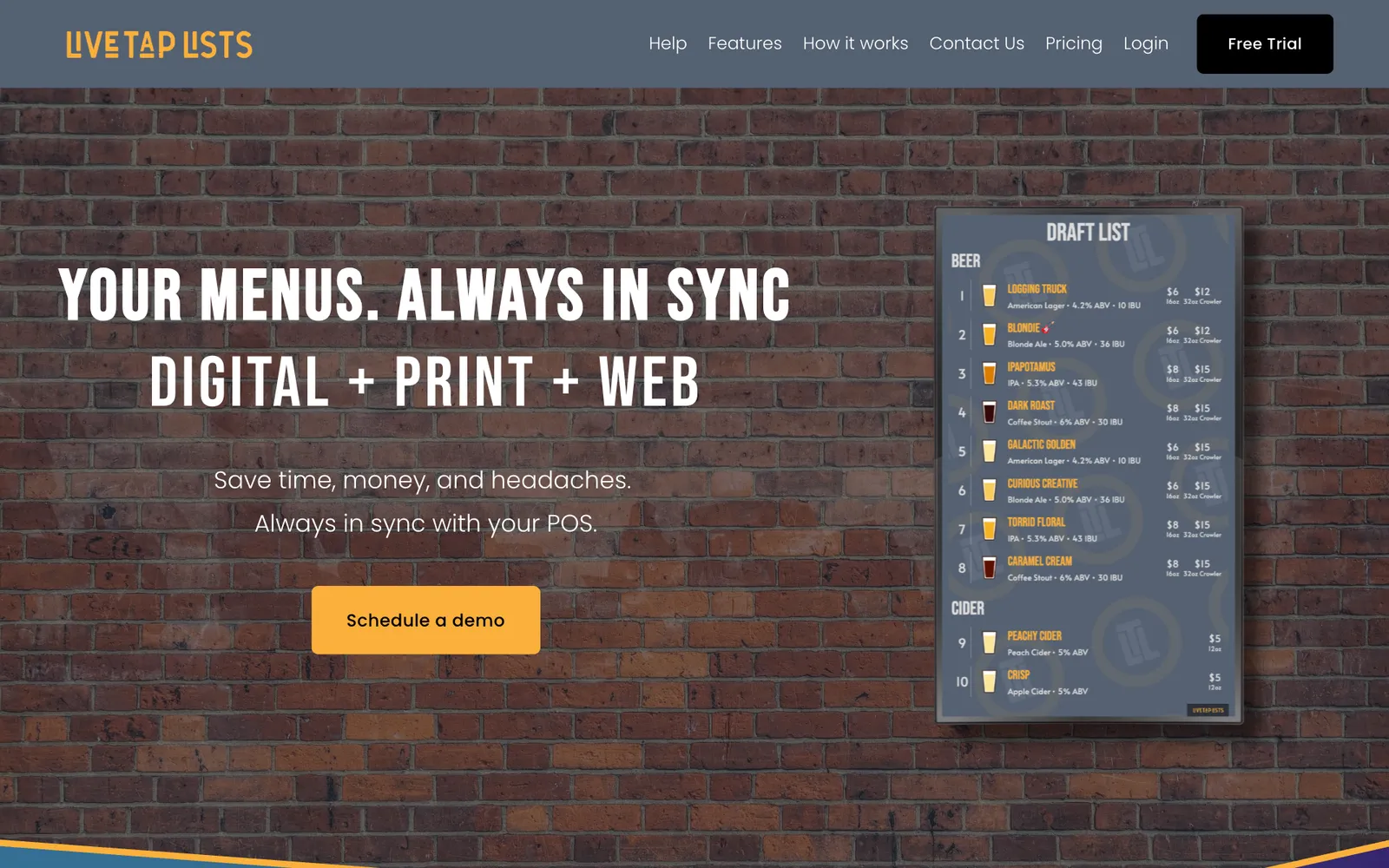
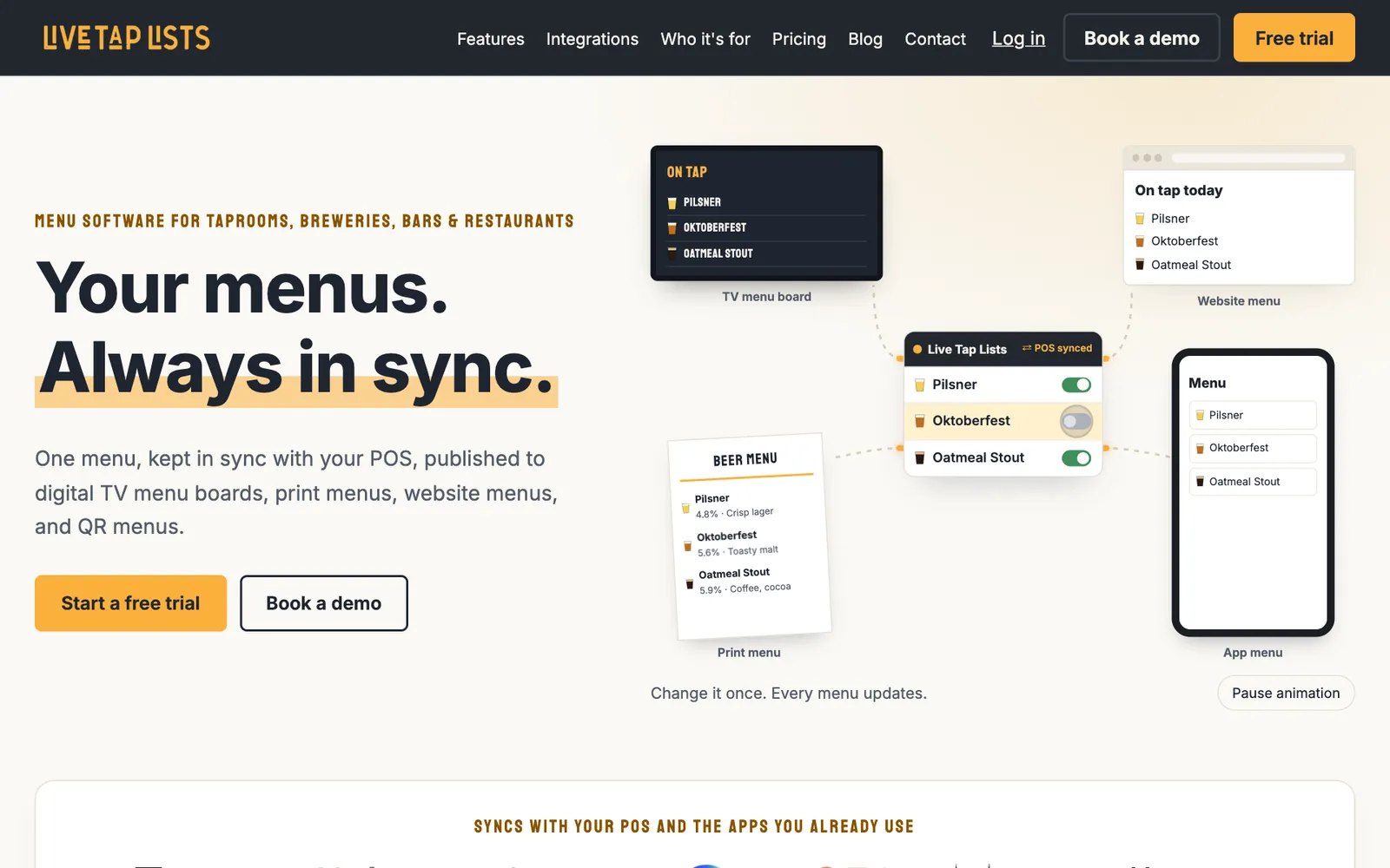
Now going from learning about Live Tap Lists to using it every day feels like one product.
What didn’t change
We were careful here, because simplicity is why many of you chose Live Tap Lists.
- Your menus look exactly the same. TV boards, print menus, website embeds and QR menus render just as they did before.
- Nothing moved out from under you. Every feature, setting and integration is still there and works the same way.
- There’s nothing to set up. Log in and you’ll see the new look.
Keep the feedback coming
This redesign exists because you told us what would make Live Tap Lists better. Please keep telling us. If something feels harder than it should, or you have an idea that would save you time, get in touch. We read every message.
Cheers, The Live Tap Lists team